Self-initiated concept · Brand identity · Packaging system · 2026

NEUROGRAM

Made from oats.
Built from fragments.

A multi-format oat drink packaging system organized around four emotional states and a twelve-part visual archive.

Concept project — not a commercial food product.

4 emotional states 3 carton formats 12 visual fragments
The four NEUROGRAM oat drink packages: ORIGIN, FOCUS, COMFORT, and RESET.
Four core drinksORIGIN · FOCUS · COMFORT · RESET
Category

Brand identity and packaging system

Product

Self-initiated concept oat drink range

Formats

1.5 L · 500 mL · 350 mL

System

Four SKUs · Twelve rotating fragments

The complete NEUROGRAM oat drink family lineup.
Four emotional states · One packaging system
Daily rituals

From packaging system to everyday moments.

NEUROGRAM extends beyond the carton into quiet daily use — from selecting a drink at home to preparing coffee with intention.

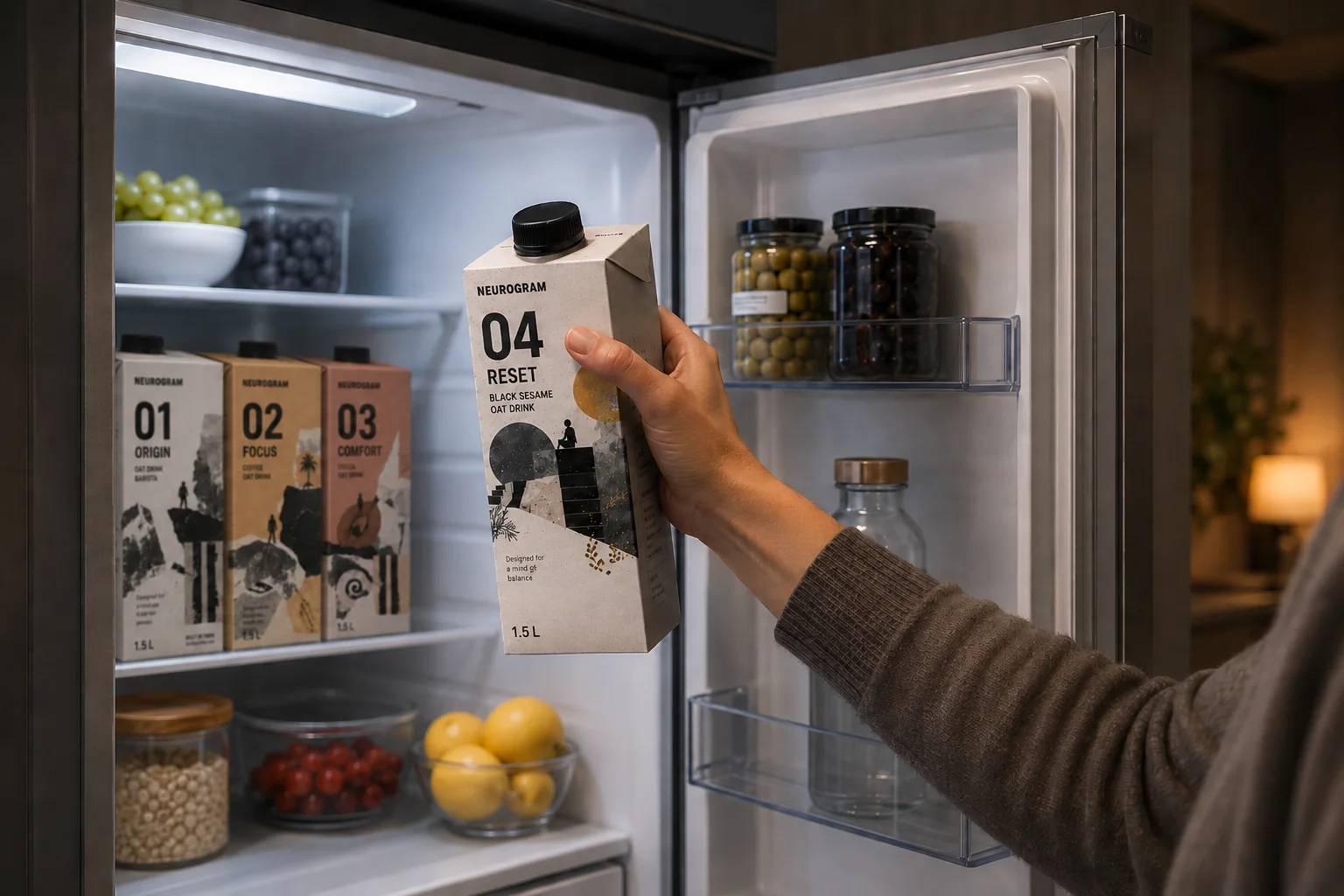
NEUROGRAM RESET oat drink selected from a refrigerator.
RESET · Evening pause at home
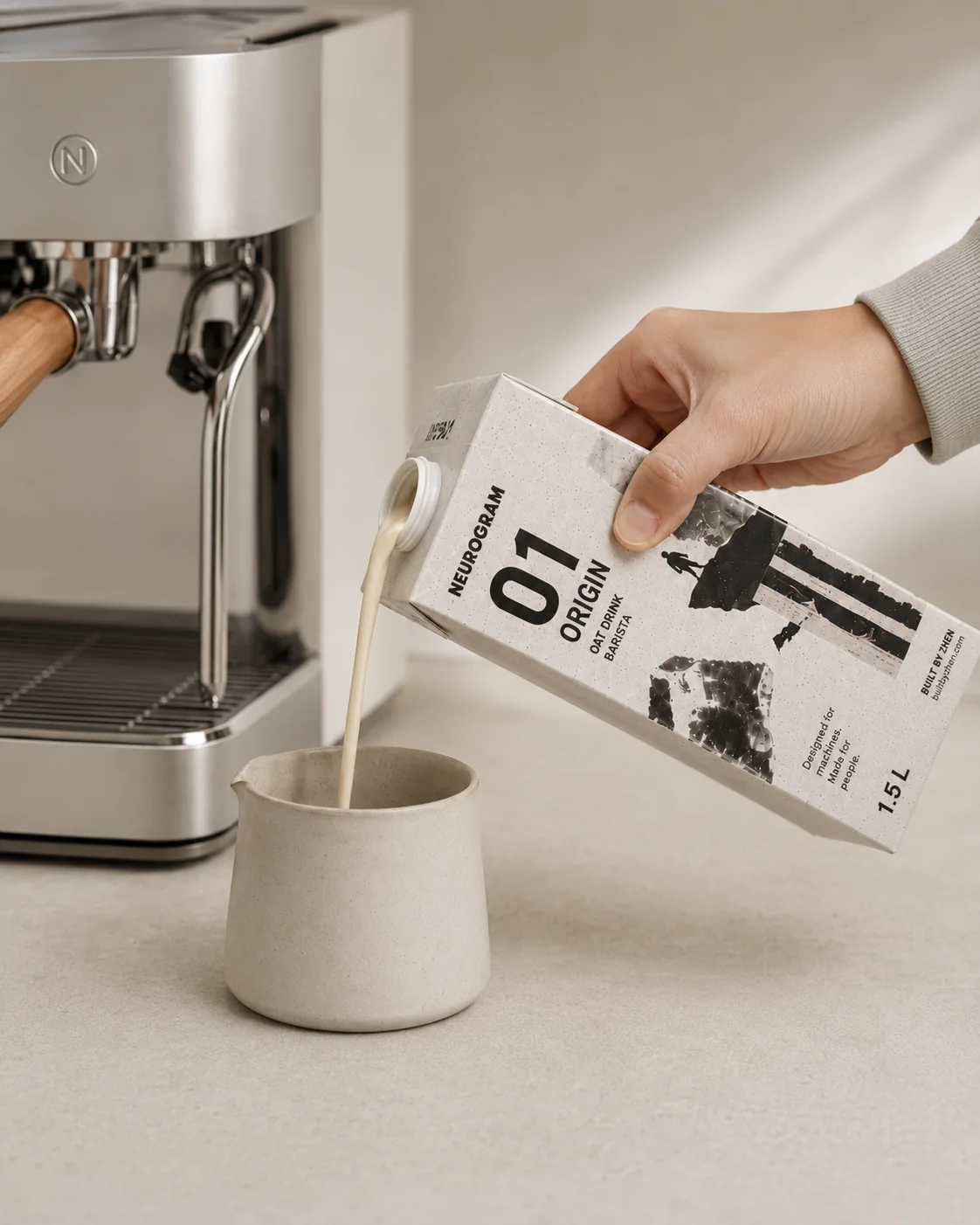
NEUROGRAM ORIGIN oat drink used beside an espresso machine.
ORIGIN · Designed for coffee rituals
Project overview

Growing up is rarely remembered as a complete picture.

It returns in fragments—places, fears, decisions, pauses, and moments understood only later. NEUROGRAM turns those fragments into a visual archive carried across an oat drink system.

The project began as a personal collage study and was rebuilt as a coherent product family: four flavor identities, three packaging formats, production-aware information zones, and a visual archive that can rotate without breaking recognition.

The carton structure remains familiar. Its character comes from a quiet typographic grid, state-specific color, numbered hierarchy, and handmade collage evidence carried across every format.

Four product states

Different moments.
One foundation.

Each SKU owns a color, flavor, emotional territory, and primary fragment while sharing the same packaging architecture.

01 / ORIGIN

The original foundation.

Begin with what remains.

Growth rarely begins as a complete picture.

ORIGIN represents the first pieces: unfinished ideas, small decisions, and quiet moments that gradually become a foundation.

1.5 L system

Hero render, panel hierarchy, specifications, and fragment framework.

Format extension

The same theme is responsively reframed for 500 mL and 350 mL cartons.

02 / FOCUS

Direction without visual noise.

Keep the signal clear.

Focus is not intensity. It is direction.

FOCUS reflects the moment scattered pieces begin to align—when uncertainty becomes movement and attention finds somewhere to go.

1.5 L system

Coffee-specific flavor language, machine-use context, and the FOCUS visual hierarchy.

Format extension

A shared FOCUS theme is recalibrated for tall and compact proportions.

03 / COMFORT

A warmer, softer state.

Some fragments need space.

Comfort is not an escape from difficulty.

It is the space that allows fragmented experiences to settle, overlap, and reconnect without demanding an immediate resolution.

1.5 L system

Cocoa flavor profile, warm state language, and full carton-panel development.

Format extension

The same Terracotta Cocoa identity is held consistently across both smaller cartons.

04 / RESET

Pause, reassemble, continue.

Pause. Reassemble. Continue.

Reset does not mean starting over.

It means pausing long enough to rearrange what remains—keeping what matters, releasing what does not, and continuing differently.

1.5 L system

Black sesame flavor, renewal narrative, and a controlled gold accent.

Format extension

Black caps and Sesame Gold stay consistent across the two smaller formats.

Color and format system

A stable presentation field lets each state remain distinct.

The page background stays fixed while product color, collage density, and accent behavior change by SKU.

Master palette

#E5DFD9Background#171512Near Black#AAA29ADivider#E4DED7Warm White

SKU palette

#DED7CE01 ORIGIN#D6AB7C02 FOCUS#CC9F8803 COMFORT#D9D1C904 RESET#BE995DSesame Gold

Product formats

1.5 L

Home, studio, and professional use.

500 mL

Personal multi-serve format.

350 mL

Compact, on-the-go format.

Fragment archive

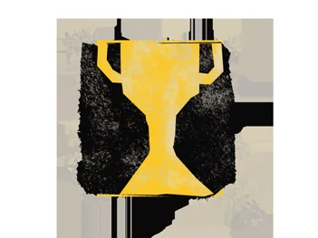
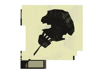
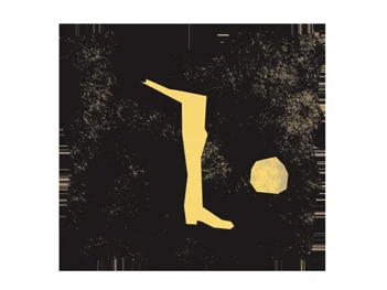
Twelve images form a changing record of growth.

Rotating artwork can change the expression of a package while its SKU number, color, and information hierarchy preserve recognition.
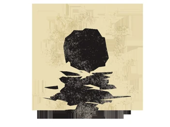
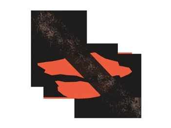
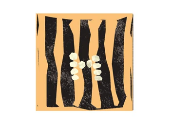
Fragment 01: Growth.
01

Growth

ORIGIN

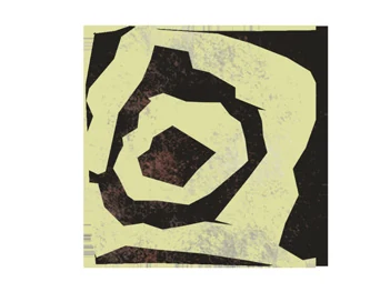
Fragment 02: Friction.
02

Friction

FOCUS

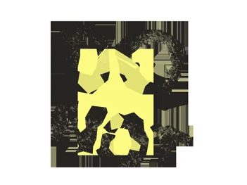
Fragment 03: Formation.
03

Formation

ORIGIN

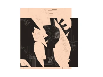
Fragment 04: Direction.
04

Direction

FOCUS

Fragment 05: Vulnerability.
05

Vulnerability

COMFORT

Fragment 06: Ambition.
06

Ambition

FOCUS

Fragment 07: Connection.
07

Connection

COMFORT

Fragment 08: Momentum.
08

Momentum

FOCUS

Fragment 09: Fear.
09

Fear

COMFORT

Fragment 10: Renewal.
10

Renewal

RESET

Fragment 11: Excitement.
11

Excitement

ORIGIN

Fragment 12: Recognition.
12

Recognition

COMFORT

Packaging-to-page system

Scan the archive.

The permanent project address gives the QR system a stable destination while future packaging artworks can link to individual fragment anchors.

builtbyzhen.com/neurogram

QR code linking to the NEUROGRAM project page.
A concept by Built by Zhen

Early study → product system

The distance between the two versions is part of the work.

The redesign preserves the original pressure marks, torn edges, taped repairs, and emotional subjects while introducing repeatable product logic.
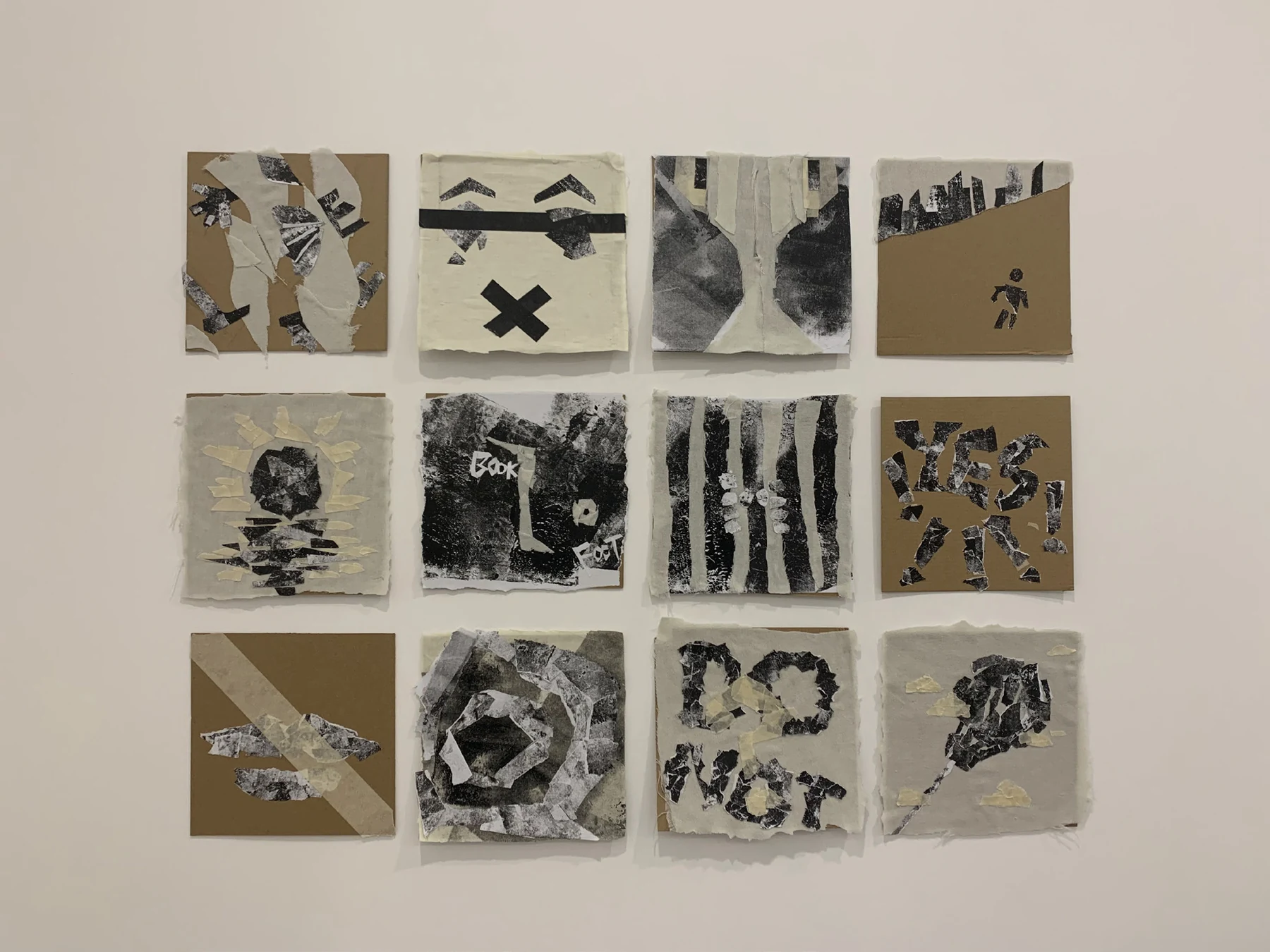
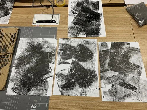
Original NEUROGRAM collage studies displayed on a wall.
Early studyHandmade collage as a record of memory and growth.
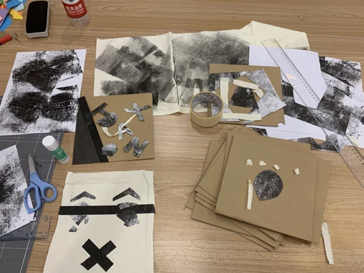
Original printmaking and texture experiments.
ProcessPrinting pressure, texture, and imperfect transfer.
Original collage assembly process.
ProcessCutting, tearing, testing, and reassembling fragments.
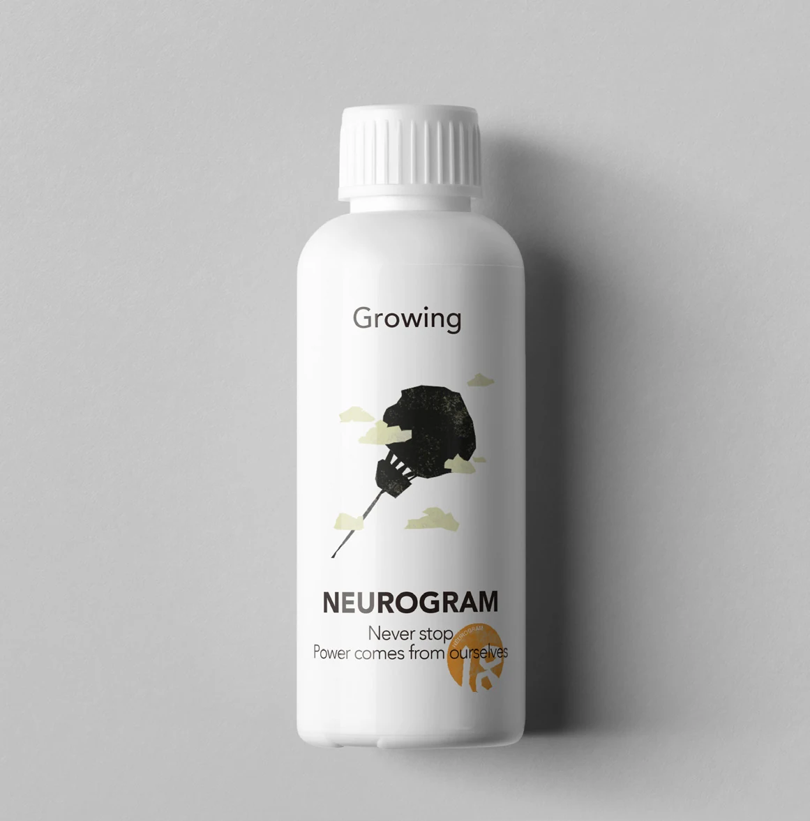
Original NEUROGRAM bottle packaging concept.
Original applicationThe first packaging direction before the oat drink system.

Project status

A self-initiated concept, not a commercial food product.

NEUROGRAM is a concept packaging project developed by Zhenhua Chen under Built by Zhen. Product formulations, nutritional information, environmental claims, certifications, regulatory statements, and production specifications shown in the visualizations are illustrative and would require validation before commercial production.

The packaging forms are production-aware concept references; final dielines would be developed with a packaging supplier.

Built by Zhen

Rebuilding an early personal study as a coherent identity, product family, and packaging system.

Return to studio homepage